How We Replaced Repetitive Dashboards with an MCP
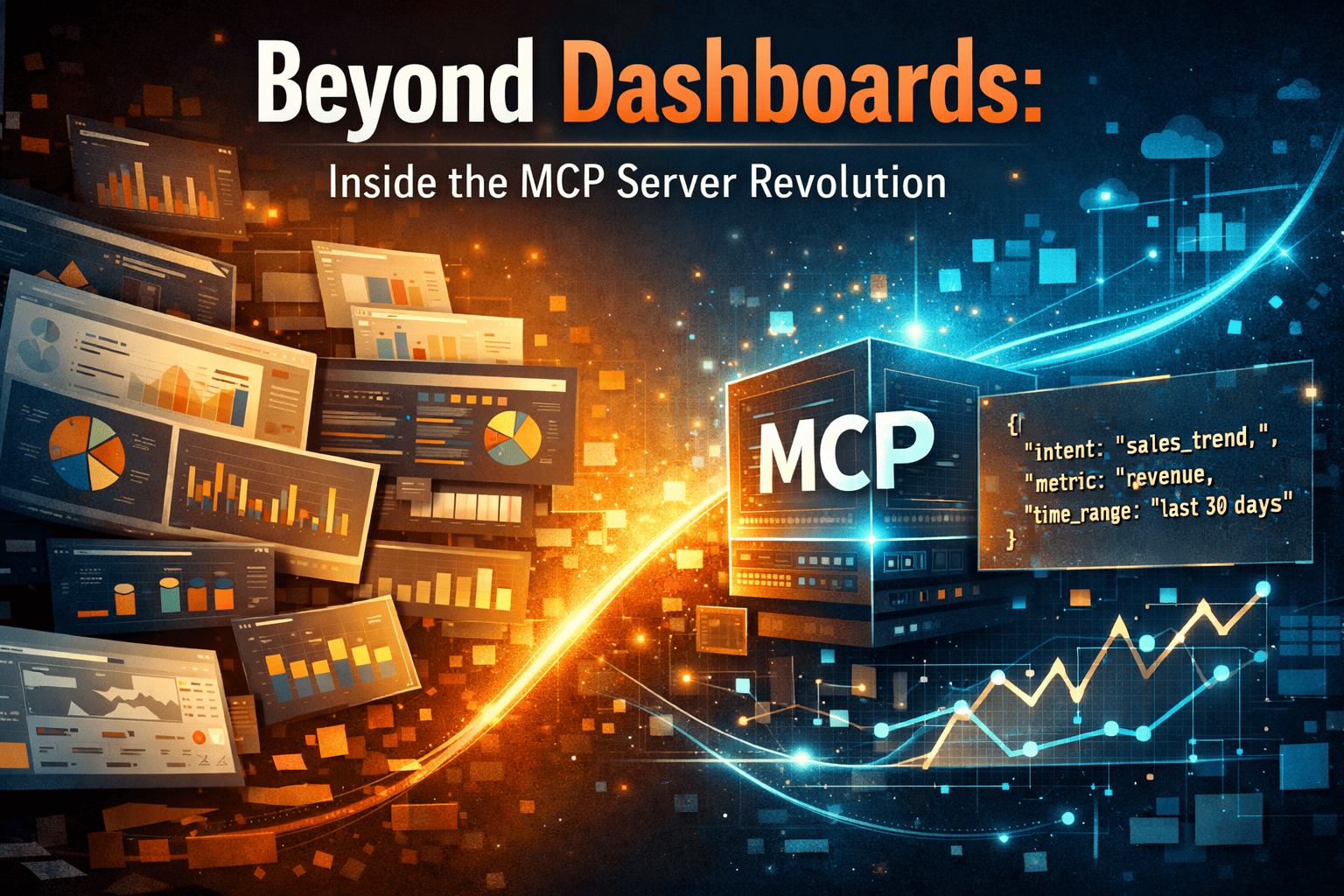
Why dashboards don’t scale with curiosity—and how an MCP (Model Context Protocol) server helped us move from static dashboards to intent-driven analytics.
Every question from the business had the same answer from us:
“Sure, we’ll create a dashboard for that.”
New metric? Dashboard.
Different region? Dashboard.
Same data, slightly different view? Yep—another dashboard.
At some point, we stopped building insights and started maintaining screenshots.
This is the story of how we hit that wall—and why we built an MCP (Model Context Protocol) Server instead of yet another dashboard.
The Moment We Realized Dashboards Were the Problem
It wasn’t one big failure. It was death by a thousand small requests.
- “Can we split this by customer type?”
- “Can we see this monthly instead of quarterly?”
- “Same thing, but for a different product.”
Each request was reasonable. Collectively, they were exhausting.
Behind the scenes, we were:
- Copy-pasting SQL
- Duplicating metric logic
- Fixing the same bug in five dashboards
- Explaining why two dashboards showed slightly different numbers
The worst part?
None of this work made the data better.
It only made the surface area larger.
Dashboards Don’t Scale With Curiosity
Dashboards are great when:
- The question is fixed
- The audience is known
- The metrics rarely change
But real users don’t work like that.
They explore.
They ask follow-ups.
They change their minds mid-conversation.
Dashboards freeze questions in time.
Every new question becomes a Jira ticket.
Every Jira ticket becomes a dashboard.
Every dashboard becomes technical debt.
“Why are we building UI for every question instead of solving the question itself?”
The Shift in Thinking: From Dashboards to Context
The breakthrough was simple—but uncomfortable:
Most dashboards weren’t unique. The context was.
Same data.
Same metrics.
Same joins.
Different filters.
Different cuts.
Different intent.
So instead of designing screens, we started defining context.
That’s where the MCP (Model Context Protocol) Server came in.
What the MCP Server Actually Is (In Plain English)
The MCP server is not a BI tool.
It’s not a dashboard engine.
It’s a layer that knows:
- What data exists
- What metrics mean
- How dimensions relate
- How people usually ask questions
It sits between users (or AI) and data and answers one question:
“Given this intent, what insight do you want?”
Define Metrics Once. Stop Arguing Forever.
We moved every important metric into the MCP context.
{
  "metric": "revenue",
  "definition": "SUM(sales_amount)",
  "grain": "monthly",
  "currency": "USD"
}
No dashboard-owned logic.
No tribal knowledge.
If revenue logic changes, it changes once.
That alone killed half our dashboard issues.
From “Build Me a Dashboard” to “Answer This”
Here’s a real example.
Old world
“Show sales trend for Product X in EU for the last 6 months.”
Response:
- Create dashboard
- Write SQL
- Add filters
- Review
- Iterate
MCP world
Same question becomes intent:
{
  "intent": "trend",
  "metric": "revenue",
  "dimensions": ["month"],
  "filters": {
    "product": "Product X",
    "region": "EU",
    "time_range": "last_6_months"
  }
}
The MCP server does the boring part.
Yes, There’s Still SQL (But You Don’t Babysit It)
SELECT month,
       SUM(sales_amount) AS revenue
FROM sales
WHERE product = 'Product X'
  AND region = 'EU'
  AND sale_date >= CURRENT_DATE - INTERVAL '6 months'
GROUP BY month
ORDER BY month;
The difference?
- This SQL isn’t tied to a dashboard
- It’s generated, not copy-pasted
- It disappears when the question disappears
As it should.
Visualization Without Dashboard Worship
Instead of shipping UI, MCP returns meaning.
{
  "visualization": "line_chart",
  "x": "month",
  "y": "revenue",
  "data": [...]
}
Frontend renders it.
Tomorrow it might render it differently.
The insight stays the same.
What Changed for Us
Before:
- Dashboards multiplying every sprint
- Engineers fixing layout instead of logic
- Business waiting for answers
After:
- Fewer dashboards, on purpose
- One place to fix metrics
- Faster answers to messy, real questions
We didn’t eliminate dashboards.
We demoted them.
When This Approach Is Worth It
An MCP server makes sense if:
- You’re drowning in “small dashboard changes”
- Metric consistency actually matters
- Users ask exploratory questions
- AI / natural language search is on your roadmap
If your problem is pretty charts, this won’t help.
If your problem is repeated thinking, it will.
Final Thought
Dashboards feel productive because they’re visible.
But visibility isn’t insight.
By building an MCP (Model Context Protocol) Server, we stopped designing screens for every question and started designing understanding.
And honestly?
This was the moment our analytics stack finally worked with us—not against us.
If your dashboards feel like friction instead of insight, let’s fix that
together.